

BRAND design PORTFOLIO
my brand design process thrives somewhere between intuition and intention. i dive deep into your story to uncover what makes your brand magnetic, then create an identity that aligns with that.

branding stuff i can help you with:
☑️ logos, fonts, colors, & more
☑️ websites
☑️ art direction
☑️ audits & consulting
☑️ consulting
☑️ collateral creation
SEPTEMBER 2025
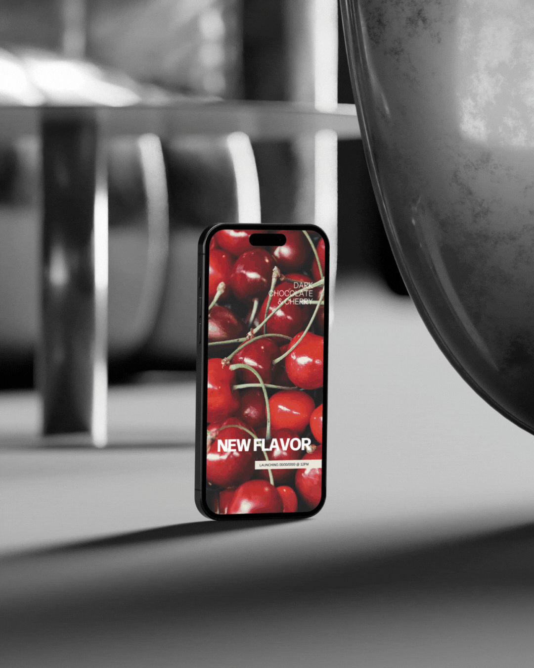
love, sundays.
these snacks are all about comfort, wellness, and feeling good — so why shouldn’t the branding feel the exact same way? scroll to see what i created!
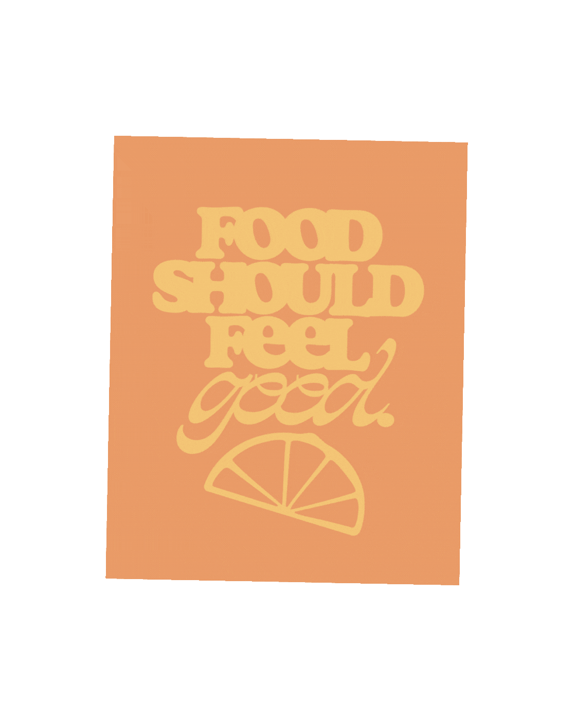


(01) LOGO SUITE
i wanted to create a logo for LS that could sit in the background as its future packaging takes the main stage, but is still unmistakably on-brand. it feels welcoming, happy, and like coming home on a sunday.

(02) COLOR PALETTE
these colors feel like a warm hug, a homemade meal, and a peach in the summertime. we opted to stay away from pitch black and stark white to avoid any clinical feelings, choosing a brown and cream instead, and a spectrum of warm colors between both.

(03) TYPE SUITE
sitting somewhere between quirky, retro, and soulful, these fonts complement each other in a way you can almost taste. they’re welcoming and familiar, but with an underlying energy of youth and breaking tradition.


(04) BRAND ELEMENTS & PATTERNS
i created a set of custom illustrations for LS using some food items that are commonly used in southern cooking and some abstract elements that can be used for decoration. the asymmetry and roughened edges of each illustration are a reminder that this business started on creations made by hand.
AUGUST 2025
pose studio
pose studio is a hot yoga and pilates studio opening in glassboro, NJ that needed a full visual identity to match its mission: creating a calming, nurturing space where anyone can come to heal. scroll down to see what i came up with!
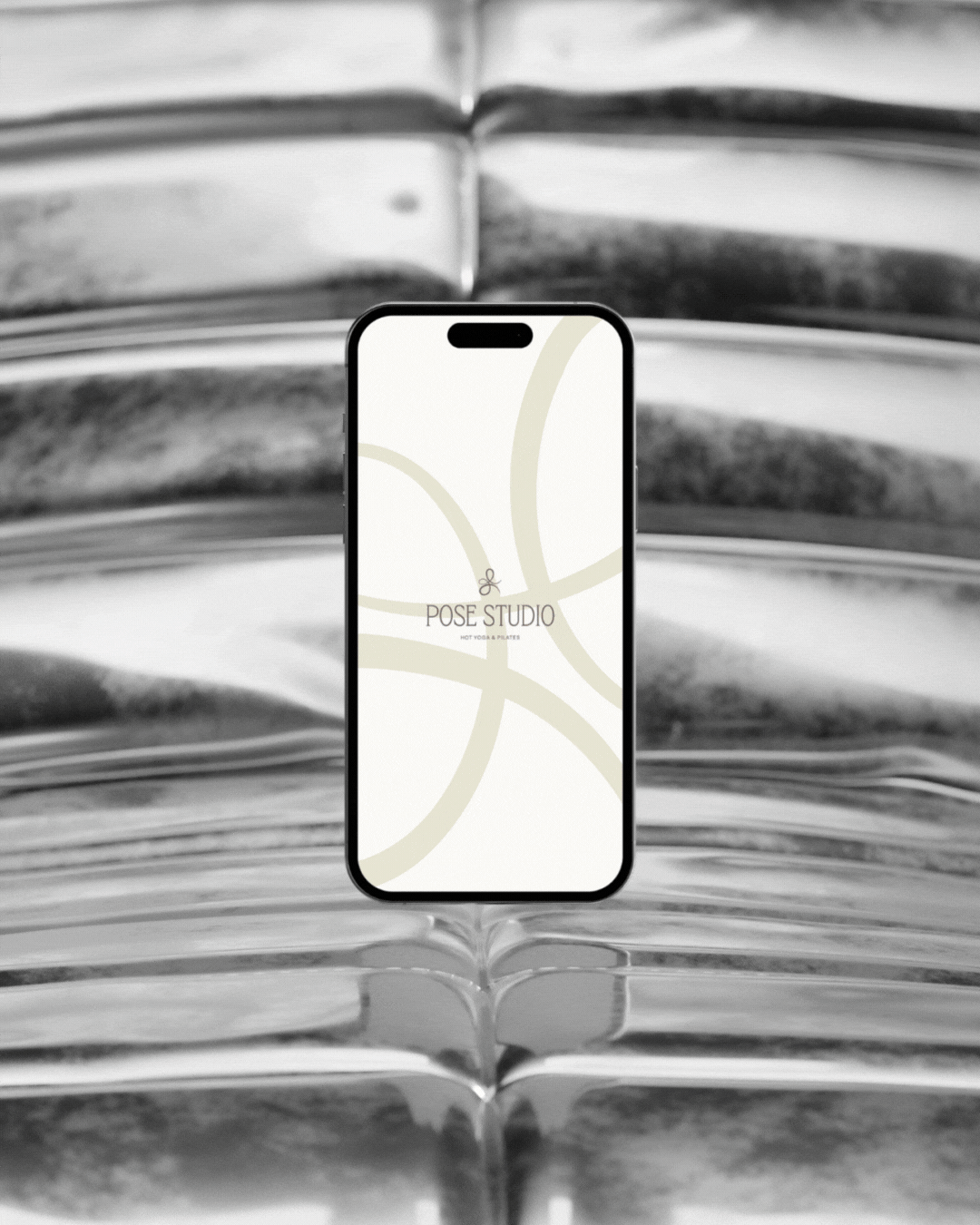


(01) LOGO SUITE
i’m personally tired of seeing yoga/pilates studios with logos that feel like clip art and templates, so instead, i illustrated this minimalist, abstract take on the warrior II pose. i used a continuous line to emulate the flow of energy and air we send through our bodies during intentional movement.

(02) COLOR PALETTE
when chatting with the pose founders, dana and alyssa, i was shook at how palpable their chill vibe was. this made selecting their brand colors super intuitive — serene blues and greens paired with earthy tones.

(03) TYPE SUITE
given that pose is opening in a college town (shoutout rowan university), i intentionally selected fonts that felt modern and stylish enough for a young girl to deem insta-worthy, but also tasteful and timeless enough for her mom to join her and not feel out of place.
FEBRUARY 2025
life curious women
as an uplifting community for women, this brand should be cute, viral-worthy, and attention-grabbing, but also have an energy of “she knows what she’s doing.” i created a brand identity that matched ashley and her clients’ fiery personalities, making it more aligned for her to show up as the confident founder she is.


(01) LOGO SUITE
founder, ashley, wanted a logo for her business that felt uplifting, motivating, and chic. we initially both opted for a more delicate serif, but realized it wasn’t feeling quite bold enough, so we switched gears to this funky, chunky sans. the starburst carved out of the W adds both customization and an air of magic — the feeling you can achieve anything you want to.

(02) COLOR PALETTE
inspired by the qualities of a life curious woman, i came up with a color palette that feels bright and spunky. it’s eye-catching and bright, but not immature.

(03) TYPE SUITE
the old heading font became the new subheading font, and paired with the font from the logo, it’s giving complexities of a woman’s personality. being that LCW is an information-heavy brand, i opted for an easy-to-read (but still cute) body font. overall, the type suite feels intentionally-mix-and-matched, stylish, and modern.

(04) BRAND ELEMENTS & PATTERNS
what’s a fun, girly brand without stickers?! using the colors and vibes we came up with for LCW, i created a set of stickers for ashley to use wherever her messaging could use a little pizzazz.
JUNE 2024
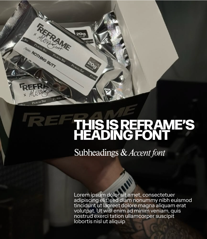
reframe protein
founder, KT, started this company to simplify and redefine the protein bar. that’s why the branding i created is a harmonious blend of classic design layouts and gritty, unique elements.

(01) LOGO SUITE
this brand is all about seeing things from a different point of view. i involved some minimalist frame elements around the R in the logos, making it almost feel like looking into a viewfinder on a camera.

(02) COLOR PALETTE
i created this simple base palette for reframe containing signature colors and classic contrast. these colors are clean and natural; they feel thoughtful and pensive, but never intimidating.
(03) TYPE SUITE
i wanted to choose fonts that could act as the backbone of the reframe brand identity, simplicity and approachability being a key factor. these fonts allow for the design and product to take the spotlight, giving the brand room to shapeshift as it grows.